Showing posts with label applique quilt. Show all posts

Saturday, April 15, 2023

A Quilt Top Marathon

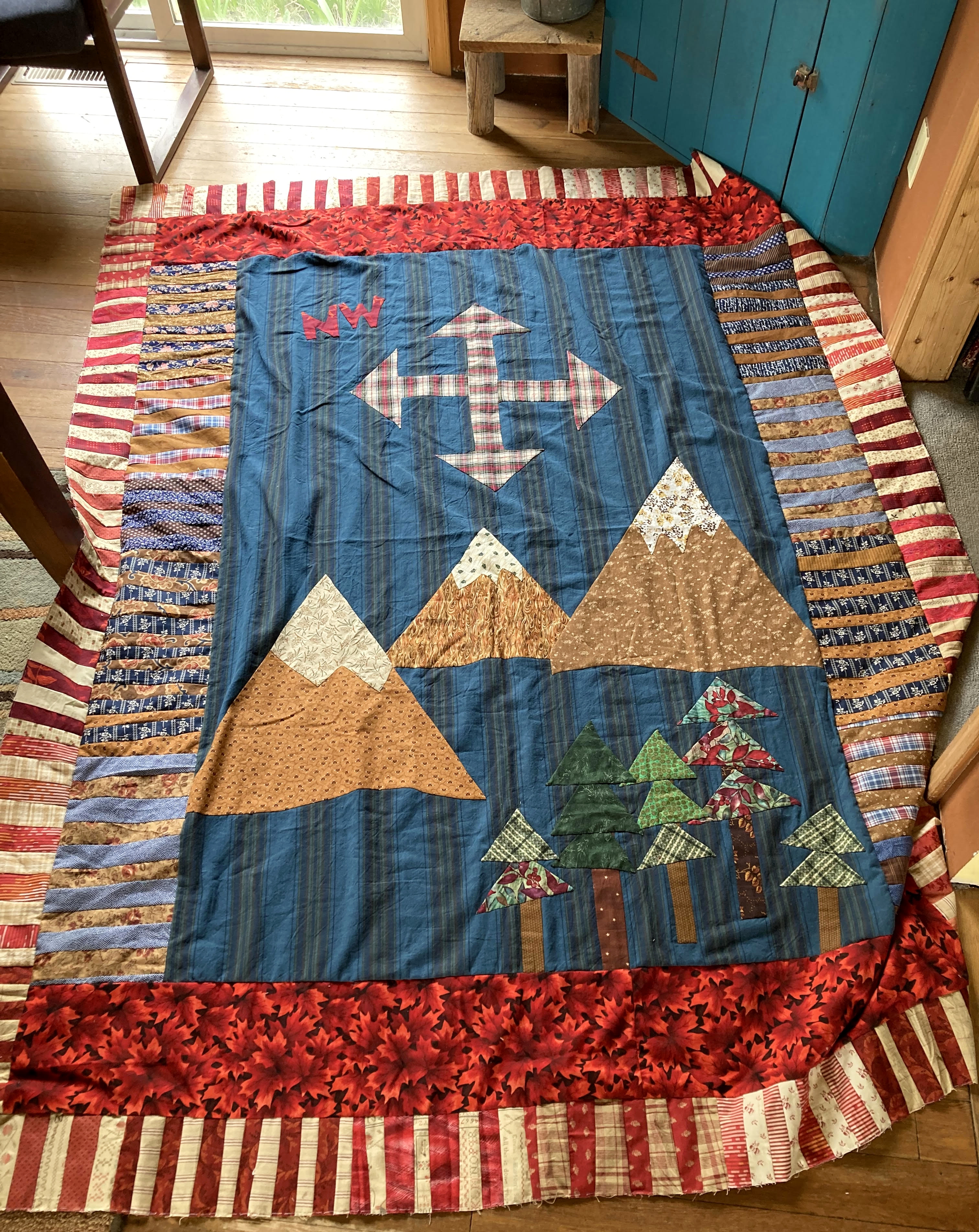
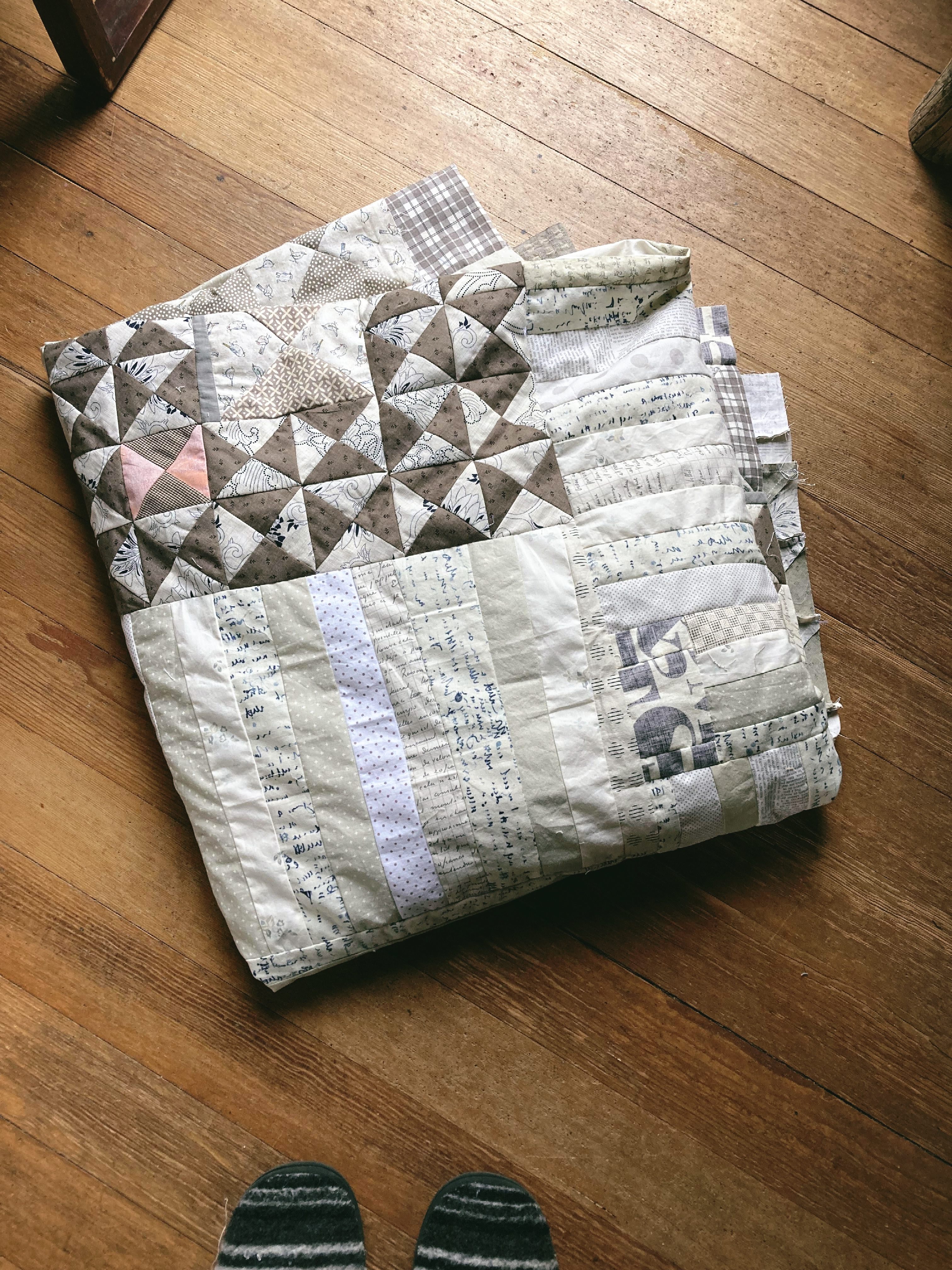
 This past week or two found me spending quite a bit of time bringing a couple projects to quilt top stage. The first one 'The Mountains Are Calling', has been in the works for a long time. First, I cut out a whole lotta free-cut strips and started in on the back of the quilt.

Tags quilt
Just wanted to do more improv. strip piecing and sewing plus use up some more languishing fabrics. I had a vague outdoor-ish look and feel in mind for the front of the quilt, but didn't really grab a hold of anything solid until the back was finished a couple months later. The struggle was undoubtedly made worse by the fact that the strips were cut out in red, blue and tan or cream. Isn't that more Americana rather than outdoors? Sometimes I just have to laugh at myself!

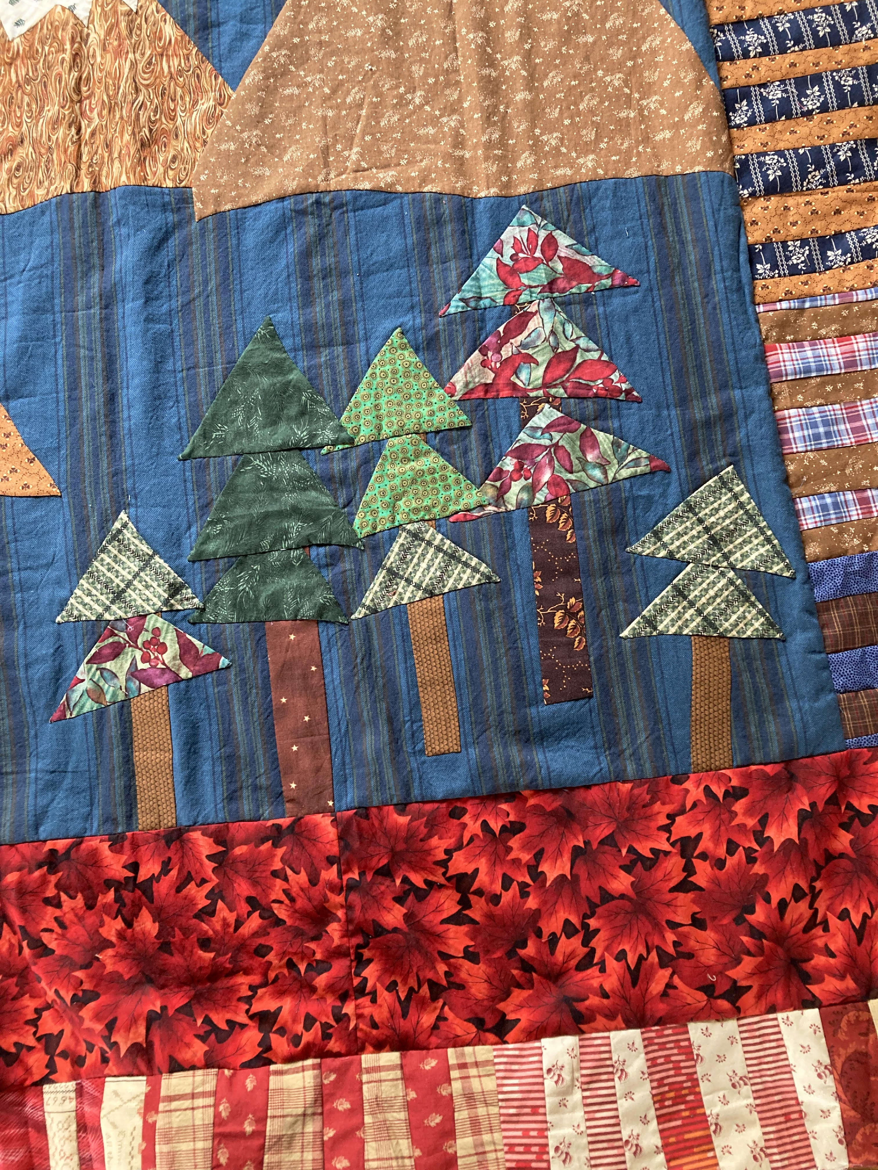
A few interesting trees
I eventually settled on a mountains and hiking vibe knowing this had always been intended for my youngest son. I kept thinking about adding words to the quilt, perhaps a hiking quote? Wouldn't that be fun and interesting? And it always felt like a little bit too much. Made it hard to gain any traction on the front as all my ideas just sort of floundered and dried up. Honestly, he just wouldn't care either way. A quilt from mom? Check. Large enough to tuck under his feet and chin both? Check. Not too girly or fussy looking? Check. 

A compass
And so it was a relief to finally decide how to make the top large enough to work with the backing and still give off a relatively simple 'guy' look and feel. Why are guy quilts so tricky when really, the key is to keep them simple? Bonus--I was able to use up most of the leftover improv. strips, plus a lot of that red leaf fabric. It's been in the stash totes for well over a decade! Now I just need to schedule in some time with the quilting hoop sometime this summer and get it handed over while he still loves to hike...

Looking across the quilt
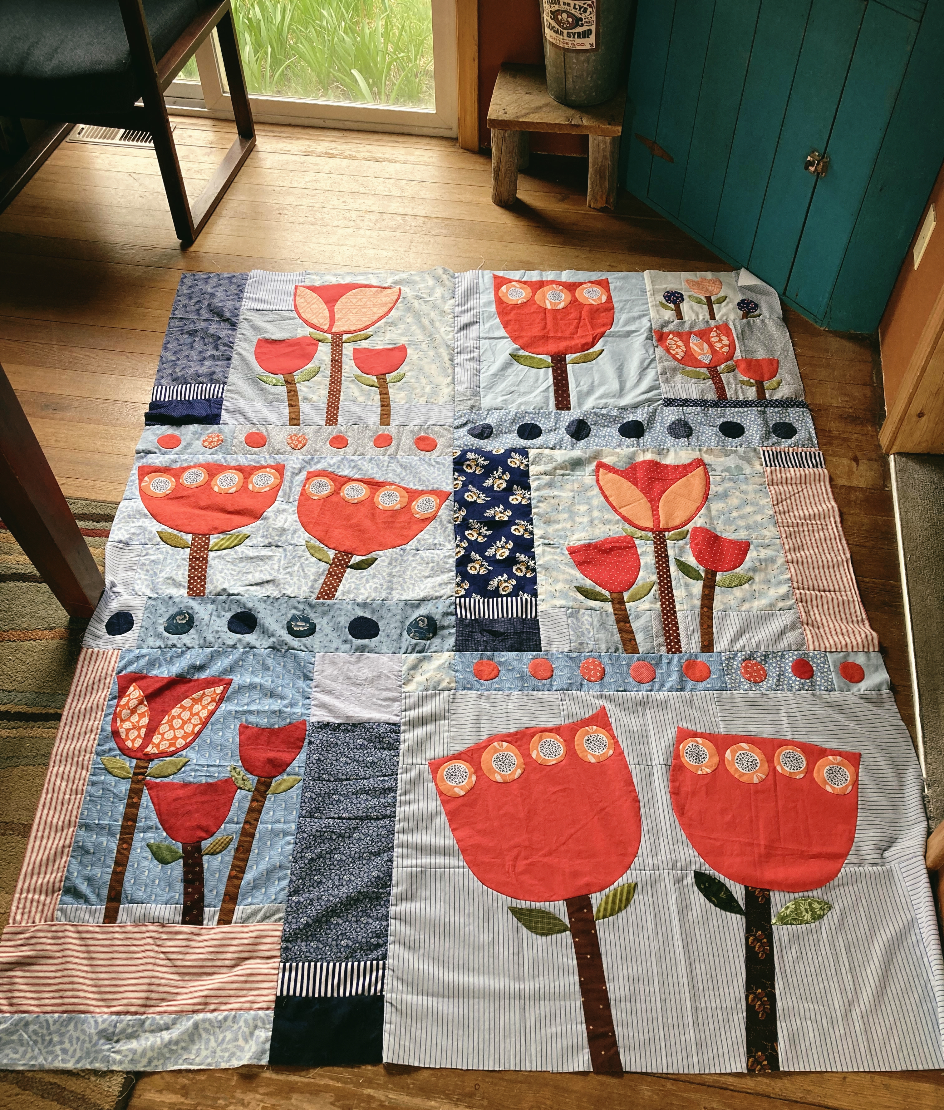
Next up on the list of projects that were nagging at me, was Revised. It's the Color Palette challenge from the AHIQ blog. Once all the applique was stitched down, then it was just a matter of making time with the design floor and the final layout.
Revised is a finished quilt top!
It took a little bit of puzzling to get all the math figured out for the smaller filler pieces, but it wasn't difficult. All the larger applique pieces had been graphed out on paper so I knew the basic layout should work.

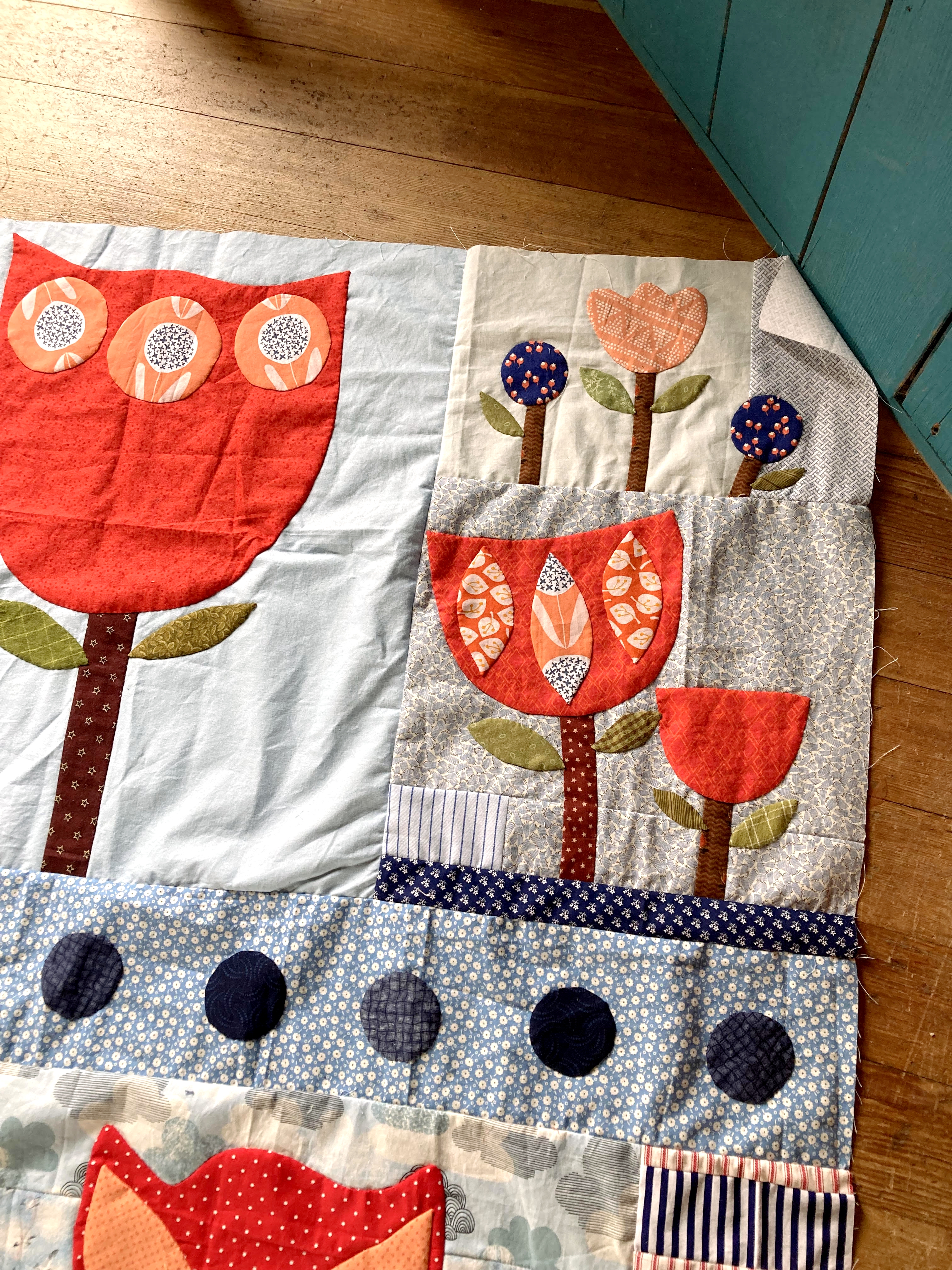
Loving these smaller blocks
I'm still thinking that the tulips are a bit more awkward and clumsy looking than they probably should have been, but the whole look is growing on me. A little bit of a prim look combined with utility--a match made in heaven!
Simple fill-in with the directional fabric
Not seeing this with borders, at least not at this point. Shocking, I know, but it feels rather complete already without them. We'll see what happens after it sits in the quilt top drawers for a couple months. Will it be grumbling and starting to want a little more attention?
Rough circles to break up the look of the tulips
The only color in the original inspiration that didn't make it into the quilt was a sharp greenish yellow. Just could not find a good place to introduce it with these tulips, though I tried and tried. I'm actually contemplating adding it onto the quilt in the binding! Wouldn't that be different!
Very brash tulips
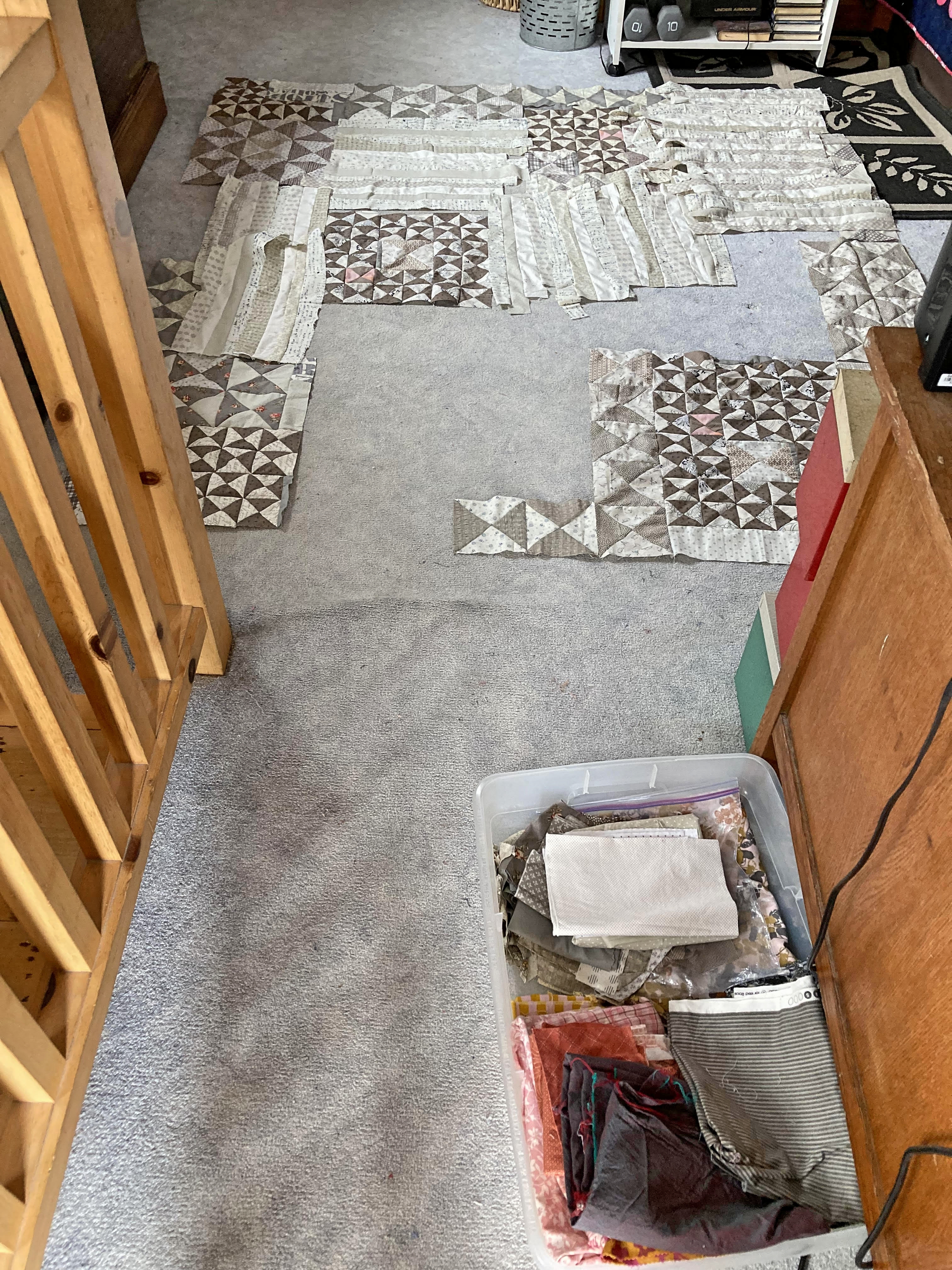
After these two quilt projects were taken care of, then I turned my attention to the Improv. Hourglass Abstract quilt. Like I said before, just had to cut and sew another stack of improv. strips and then the top could be puzzled pieced together. It was super obvious after diving into this one, how much the previous two attempts had helped prepare my mind for just this sort of effort. I was already in the groove!

A finished background piece
I ended up working on this for two straight evenings and most of a Saturday and Sunday. Then still another late afternoon and evening after my daughter had come home and reclaimed the floor. It was a marathon! The basic shape was blocked out before with all the hourglass units sewed into rows or chunks. Next up was trying to wrangle the top into big sections of improv. that would sew together with minimal partial piecing attempts. 

Only area with partial piecing
As I sewed, trimmed, measured and sewed some more, It occurred to me that the quilt was becoming more and more square shaped. Uggh. For the sake of the future applique, it needed more of a rectangle shape in order to flow better. So that was an interesting detour, trying to add in a good two or three inches to the length of each larger section, all without making it look like I just plopped it on as an afterthought. 

Mostly though, it was a case of sewing together rows of strips, ironing them, laying them out and seeing if they were wide enough. Trimming. Adding in little piecing attempts in areas where there needed to be just a bit more filled in. Making sure the strips weren't all presenting in the same direction. Though all this is 'background' area, I didn't want it to look the least bit sloppy.
Hard to see the texture in this light
I realize the quilt looks a bit out of balance right now, but hopefully it will all make sense when the applique start coming along. Part of the top will be completely covered up. Part of it will fade directly into white noise. What's important is that the applique has something more than just a flat one-piece of fabric to rest on. Texture. That's the number one goal for this particular phase of the quilt. 

A good attempt!
Crossing my fingers it turns out to be a great looking quilt in the end, but regardless, this 'background' attempt would never be a mistake. Loving the text prints and subtle variations in the combined low-volume fabrics! One of the main repeating fabrics, a yellow-cream with a scrolled text printed over it in an indigo blue, had to be turned over as it was too loud. Yeah. So weird. But it looked a hundred times better when using the back side of the fabric, so that's the way it had to be.

The new cover
Also finally addressed the very sad state of my table top ironing board once again. Couldn't find a smaller ironing board cover here locally without buying the entire board. What a waste. Decided to do what I did last time--take a large board cover and cut it, fold it under and pin with large quilting pins. Seemed to hold up good until the top was worn out, so why not? For some reason, I don't like distracting colors on the ironing board though. Had to pay a little more for this neutral color, but I know it will be much more appreciated. Now to replace the iron. This one doesn't seem to want to get quite hot enough. I am soooo tired of buying garbage irons that just get tossed out every year or two!


Saturday, April 8, 2023

Is this Not the Best Quilt?

Well, I'm definitely going to blow up this post with waaay too many pictures of Ormes Inspired! It's totally finished now, a true blue finish. And wowsers, it looks so much better with the hand quilting! Why does it always, always surprise me to see the difference between a flat looking quilt top and one with yummy texture from stitching? You'd think I'd learn by now.

Ormes Inspired is done!
But you know me, always a roller coaster of emotions from the start of making these beauties, clear up till the final showing! Once again, I want to thank Jane Ormes {a wonderfully talented artist in the UK} for her generosity in agreeing to let me sew up an interpretation of one of her prints, titled 'Welcome to my jungle'. {She certainly took a tremendous risk not knowing me in the slightest!} This was started in 2019 and took approximately a year to bring to quilt top stage. Probably wouldn't have come together even that quickly if not for the pandemic lock downs and all the time in the world for hand applique. Ughh, don't remind me.

Seriously wishing I had some quilt holder-uppers today
While I considered the quilt top finished, my mind just wouldn't leave it completely alone. Nag, nag, nag. Months later, in January of 2021, the missing piece occurred to me out of the blue. I mean, it was SO obvious! Everything sort of clicked into place and finally, finally, the design problem from the addition of a border treatment got to be resolved in a satisfactory manner.*Whew!

Loving the look of the stitching
Why are some quilts so tricky? But you know, it was totally of my own making, all the hullabaloo with the border. I was the one who took a perfectly good design and decided it wasn't quite right for a bed quilt 'as is'. Oh yes, got a lot of feedback about that, which was super interesting when points resonated and also difficult when they didn't at all. And maybe, subconsciously, it was all about attempting to make the quilt a little more mine. Because I've NEVER done that before! hehe  Whatever. It somehow ended up being one of the coolest quilts that I have ever put together! 

So much fun in the details!
I will confess to having a bout or two of insomnia over how in the world to do the hand quilting. Part of me very badly wanted to echo stitch inside everyone of the applique motifs and then perhaps do a subtle cross-hatch etc. stitching across the entire background. Possibly little bit of the antique vibe? The quilt mostly laughed and jeered at that idea and told me it felt massively underwhelmed by that particular idea. Well. If you have to be that way!

Inspiration is always a blessing
It wasn't until the top was sandwiched and pinned that I reluctantly decided on an overall stitching effort, the 'hills & valleys' one in particular. {Baptist fans just seemed a little bit too formal, even done in the freehand method.} Then I got sidetracked by being sick for a couple months, which oddly enough gave me just enough time to properly cement the idea in my mind. Soooo, here it is. Subtle, but seemingly funky and a little bit modern and whimsical too? Definitely nothing to distract in any way from the fabulous design, which was always going to be a concern. Better to push it to shine!
Don't ever be afraid to add the elephant
I want to say that I have had the most fun making this quilt! I'm laughing while I say this, but believe me. All the hair pulling aside, this has been an exhilarating quest, up to and including the last bit of stitching. It challenged me in so many ways that have positively influenced the confidence that I have in attempting whole quilt applique efforts. I'm a better quilter today for puzzlements just like this one

You can take a look at the original print here and compare and contrast the very small changes I may have made here or there. One of the most valuable things I have learned about attempting an interpretation is that the final result will NEVER be exact. And really, why would you want it to be?

The awkward flowers are sooo sweet
The goal {generally} is to take a look at the final interpretation quilt and instantly be able to recognize the original inspiration. But.... not get too caught up in agonizing over where the math may or may not work out or how your color choices perhaps changed things to slant in a 'you' vibe. I'm not saying the original design ever needs improved upon. Not at all! We were impressed and amazed enough to feel compelled to do something with that starting point. It's just that we're all human and inevitably something is going to be different, because for one, our eyes see color differently. Our perception of what is pleasing is tuned individually. Our hands create in distinctively unique ways. It's perfectly okay and it's a beautiful thing.

This quilt ended up being made up in these precise proportions mostly because I ran out of background fabric after making a serious math error. Then I had to pick apart fabric and basically start over. Wasn't going to ditch the starting Matisse looking leaves and well, why not wing it? Make-do with what I had available using the original as the framework and not the absolute. I've always been a little shocked at how closely the quilt did in fact replicate the print! Still shaking my head in disbelief... These are life long lessons that I've already put into good use since the finishing up of this quilt top in 2020. Start out as you map out, then be very willing to adapt, adapt, adapt.

Crumples up nice and cozy looking
I get so weary with quilters who fret and stress about how the original pattern maker will feel if they change up colors or an element here or there. If they will 'like it'. For goodness sakes, just do it!! That's what quilting is all about. Taking timeless quilting motifs, patterns and elements and doing our thing, making it our own. Putting our personal little stamp on it. {In this case, it's an artists' rendering and I tried to give Jane fair warning that the outcome would likely not be identical.} Do we need to give respect and honor to the original inspiration? Absolutely! 100%. Then it goes out into the world and morphs again 1000 more times, and where are you in this equation? Probably being a tiny, little spark to a couple of people you'll never even have occasion to meet! Isn't it wonderful?

The hot pink binding ended up working out perfectly!
Okay, enough about that. At this point, I don't know how I will be able to let anyone ever use this quilt, at least until the shiny wears off. It feels a little too precious and special. I had been thinking about gifting it to a granddaughter, but yeah. It's a lot of quilt and they're pretty little yet! We'll see. I might think about putting it into a quilt show some day. Just not sure about mailing off my quilts these days.
Making a statement in the guest room
In other news, I am still pushing forward on the Improv. Hourglass Abstract quilt. The open floor is only mine for a couple more days so really, I need to get off the computer and go quilt! All the hourglass units are where they will probably remain and now I am working on sewing improv. string units to fill up all the empty space. Right now they are just loosely plopped down into the pertinent space until I can determine how many still left to cut out and sew.

Trying to piece together a background 
There should have been plenty of them, but quickly realized that I needed a whole lot more. So bad at the guestimating! Back to the stash totes to dig for more fabric, grumble, grumble... Improv. strippy piecing takes much more fabric than single pieces of fabric, but if you want that background texture? Gotta do it! Basically, I need the empty areas to be lower volume fabrics because it will provide a nice background for the large scale applique vine I'm wanting needing to do. Uh huh. It's all starting to make sense now. 

And you may or may not know this, but I have a terrible time letting go of pretty pieces of creamy white background fabrics. Yep. I'm usually quite positive there is another much more worthy quilt waiting in the wings and of course it will desperately need this or that specific fabric....

Lots of lighter areas for better flow in the quilt
In case you're interested, here's a picture of what I see when I'm rounding the corner from the quilting 'room' back into the open floor plan upstairs. Back to my design floor. Wish I had a design wall as big as the floor area, but hey! We all do what we have to do to survive. To the right is the back of my husbands desk, which is always interesting when he's working upstairs and I'm just over the partial wall, merrily quilting on the other side. Good thing we like each other, though his music now, that's not always as palatable....

Having fun stitching the details
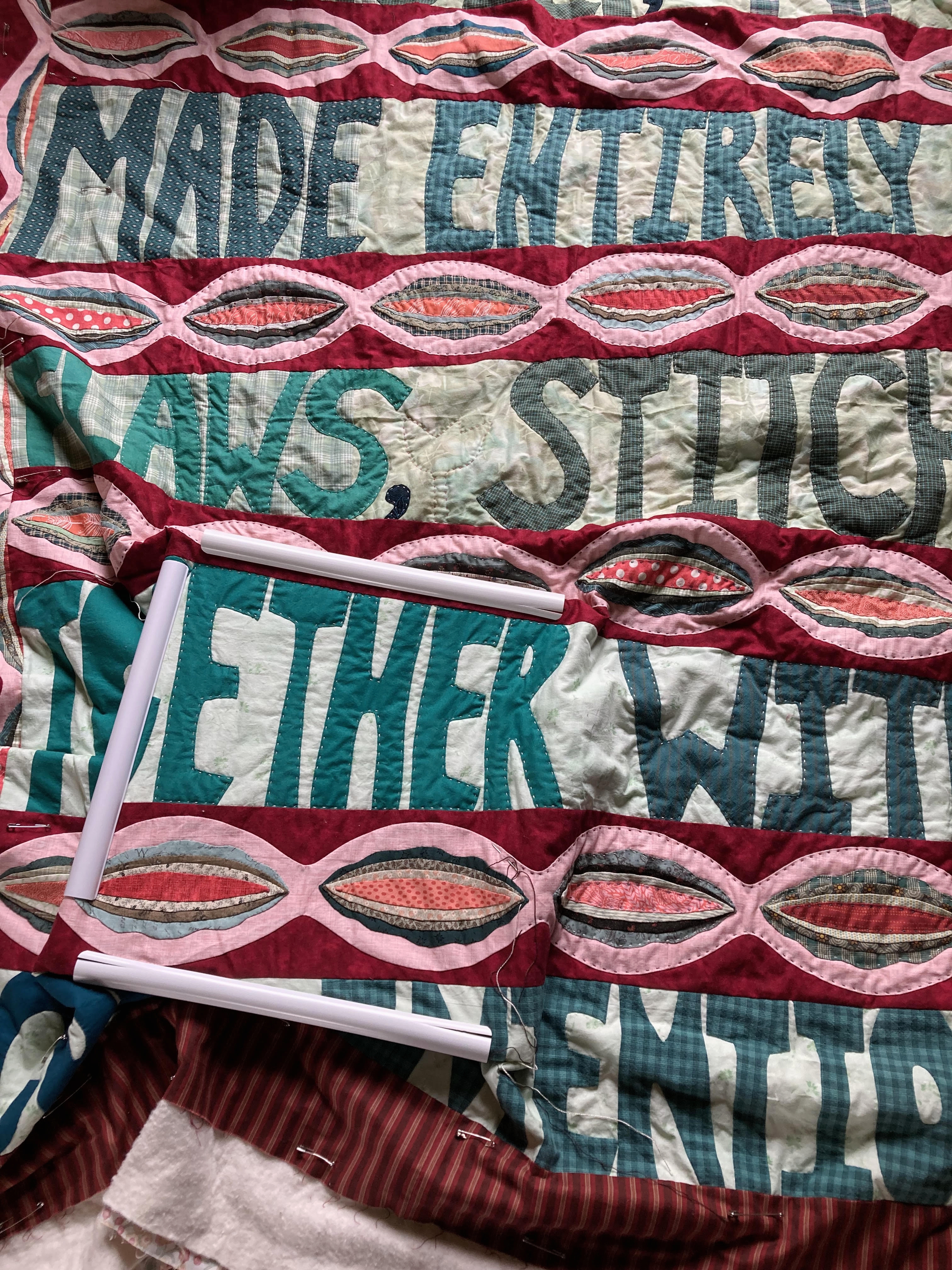
And here's a picture of the current quilt in the hoop. Making good progress with this one, though the individual hoops are taking much longer than expected to stitch. Somehow I always think that I can breeze through the hand quilting and get a hoop done in an hour or so. Uh huh. Right.... Hoping you all have a great Easter weekend! 


Tuesday, November 23, 2021

Cozier Looking Than I Thought It Might Be

 Baby quilt is done, washed up and already gift wrapped! Big, big sigh here. It was on the get-done-before-Thanksgiving list and I didn't want to have to bump it off till Christmas or try and mail it through the USPS during the holidays.

Baby quilt is finished!
It's got a slightly different look than what I normally do for baby quilts, but it still seems to work. Definitely turned out to be cozier looking than I ever expected.  Crossing my finger baby's mama will like this one, though thankfully baby Ellie won't care a whit!

Hand quilted with perle cotton
I tried to hand quilt in a way that would hold down all the bulky seams and yet still allow for a lovely drape after being well used. If I was an absolute perfectionist, there would have to be something temporarily stitched down at the edges of the border so that there wouldn't be any pull or stretch in the outside border. Uh huh. That's so not me.

A simple 'x' to help keep the corners secure
The dark green background is the part that still makes me sort of scratch my head, but it's nice to use something other than cream for the backgrounds. Love, love, love that all of the fabric in this quilt is from the stash. The cream fabric at the border is part of what I received from my aunt with the moth ball smell. After all that washing and bleaching, it's super soft and smells just fine.

Extra stitched flowers just for fun
And yep, I know what you're thinking. The cream background look still happened at the borders.*sigh  When we have a style, look, vibe we gravitate to, it's hard to deviate too drastically, right? And it softens the look of the quilts nicely. Don't you like the stitched lollipop flowers mimicking the appliqued ones? It's been a long time since I tried that. Always makes me smile!

Looks wonderful in certain lighting...
Crazy Daisy took a few days to plow through the sewing of the borders. It's such an important step and we want to make sure and do it properly. No sense taking care with the rest of the quilt if our rows can't match up and align properly.

Trying to sew up the row lengths, one by one
At first I pinned at every single seam and then I stopped and really thought it through. Hmmm... maybe only the seams at the cornerstones and wherever the seams have been ironed the opposite direction? I probably need to put some serious thought into my sewing table set up as my shoulders and neck always hurt after too much time doing this. Have to get up and stretch, roll my shoulders before getting back to it!

Love when it becomes one piece!
Amazing how much better it looks after the seam allowance disappears! It's hard to get this quilt to cooperate with the lighting, but I did my very best.

Ready to trim up the edges
Couldn't be happier with the setting triangle fabric. There's just something about a 'directional' fabric that makes my heart go pitter patter! And the rich look of the rosy red/pink colors help accent the daisy blocks quite well.

Didn't even try to match up the stripes on the edges
I really thought this one was going to be a finished quilt top at the setting triangles, but then I had a random idea. What if?

Always adding a border or two...
And you know there would be just barely enough fabric in the cheddar and the pink/red print to make it happen. Of course!  So I'd better be sure before cutting anything out! Okay, that's the last post before the holidays are in full swing. I'm planning on eating lots of goodies and spending prime time with the kids and grandkids. Sounds like all my siblings will be hanging out at mom and dads this year, so it's shaping up to be a hopping busy time all around. All the best to my American readers! Hope you have a great holiday too!


Tuesday, October 13, 2020

A Peachy Finish

So I finally got Peachy Cameo quilt hand quilted and bound! Lots and lots of distractions this past month and unfortunately, hand quilting did not always make the priority list. It turned out to be such a pleasant quilt, almost restful looking! Turns out that I adore strong blues paired with orangey reds and peach. Who knew?
Peachy Cameo is finished!

The original intent was to use loads and loads of the peach solid fabric, but somehow it only ended up with one wide border. Not terribly unhappy with that outcome as the quilt ended up with a nice peachy glow regardless. Something to remember. A little bit can sometimes go a very long ways! The fabric behind the blue circle-ish blocks is a darker peachy brown colored fabric. It was something that had languished in the stash totes for at least 10 years and finally found a wonderful home in this experimental palette. I love how the darker shade grounds the quilt just a little bit more than the lighter shades would have.

 A look at the full quilt

Every time I finish up another medallion sort of quilt, it seems that I'm raring to go on yet another. I definitely don't want all of my quilts to read this way, but hey! Medallion quilts can be sort of addictive!

Centerpiece

I don't usually put eyes on the birds in my quilts, but this one insisted. This centerpiece is not especially intricate or fabulous, but I am super happy with the overall sweetness. And the background fabric for the centerpiece makes my heart go pitter patter. Too bad I only had a fat quarter of that particular fabric!

Looking across the quilt

I think it's safe to say that many of us who have quilted for years and years often get in our little 'ruts'. We have preferences and go-to background color choices and it's easy to stay in our safe little comfort zones with very little thought. With this quilt, I was determined to step away from the cream background look that I continually turn to. Then of course, I ended up working cream into the quilt anyway, first in the very center of the quilt and then later, at the outside border. Just can't seem to help myself! I felt like the quilt needed the lighter color at the outside especially, just to continue with the soft, open look that had been developing. There's something about the way the borders almost seem to 'flow' through one another that is very intriguing to me.

Border work

This entire quilt is my own design. Like usual, in the initial planning stages, I drew up a rough draft {quilt doodle}, just basic ideas for the borders and a general plan of attack. I love starting with a scribbled-on-paper feeling of what I think/want the quilt to look like. The details are not super important at that point. It's more about getting the intended vibe drawn out in picture form before being totally forgotten and swept away in the detritus of life. You have to remember that I often take several years from the very first seed of inspiration to final quilt completion. Not to mention, there are usually many other quilts in the works at the very same time!

Overall I think this quilt was successful in maintaining most of that original intended vibe. The only thing that I wish had turned out differently, would be the green vine applique. It should have been more rounded {or bowl shaped} on the bottoms of the vine. There were several factors involved in that decision, including having to increase the vertical width of the border or potentially losing the amount of tulips and berries that could be added in. Maybe even having to make the tulips smaller? Knowing that the side borders were going to be altogether different kept me more focused on 'proportion' than maybe I should have been.

Bottom corner details

As usual, I started this quilt with a stack of long-simmering fabrics. The colors used in the centerpiece were vitally important in setting the tone of the entire quilt. I've found that if you get that part wrong, there are certain colors in that gorgeous stack of fabric that will never, ever play nicely together. Always so disappointing to have to abandon perfectly lovely pieces of fabric that originally seem destined for good use together. But it does happen. And sometimes it even hurts.

With a medallion quilt, I make notes of which color combination to try and use in each proceeding border, trying to tie back into the centerpiece of course. This is something that I audition several times throughout the making of the quilt top. If I use a lot of blues in this border, then what works best moving forward to the next round? 

Sometimes you find that a coping border will be needed and then there's the challenge of finding a fabric that doesn't read too glaringly 'off' or ends up being distracting. It's important that coping borders fill a minor role and don't take away from more complex border work done before or after.  I hit the jackpot with this very light blue fabric. For whatever reason, that soft, simple fabric ended up emphasizing my centerpiece, which was an awesome result! 

For those of you who were wondering, the light blue coping border was needed in order to have the next pieced border fit together properly.  Though it doesn't usually bother me, I didn't want anything chopped off in this quilt. And well..., it has to be said. I rarely plan ahead for perfect measurements at the exact moment of starting a quilt! Maybe I should? Hmm...  Most of you know very well by now, that my preferred method is simply 'eyeballing' things. If something looks good to my eye {or appeals to my gut instinct}, then it's a go. Everything after just has to be made to adjust and fit in. It's the human touch look that I'm after. Absolute perfection is just sooo boring!

So even with the original scribbled quilt plan, I never truly know what my quilts will look like until they are 100% completed. The entire project becomes a huge make-do effort as one decision informs the next one. That's the way that my personal creativity works best. Meeting the challenge of getting a quilt top to 'work' at each particular phase, whether that includes color, fabric, measurement issues or perhaps even needing to add in a new design element. The best quilts keep me on my toes throughout, cause me to think outside the box for solutions and often end up with something that surprises.

In this quilt, the 'surprise' is the multi-colored fabric that was used for the scalloped border. Deliberately cutting that fabric in a specific direction gives it a subtle striped look that just makes me smile. I would have thought that fabric entirely too busy for use as a scalloped border, but no! Turns out it was the perfect choice {color-wise} for that particular border and then it was just a matter of figuring out how to use it best. How could I not use it when the colors were so very spot on? We all know how difficult it is to find these pieces of fabrics when the moment is at hand. 

Okay, enough babbling. Time to quit avoiding the to-do list around here! It's good to have another 2020 finish wrapped up and behind me. 


Saturday, May 2, 2020

Ormes Inspired For the Finish

So... How bout a hundred pictures of the recently completed 'Ormes Inspired' quilt top? It was one of those spring days where it was overcast one minute and blazingly bright and sunny the next. Hopefully you can figure out the true color of the quilt eventually if you look at enough pictures!
Ormes Inspired 
This quilt top was started back in August of 2019. Sort of a spur of the moment project but then, not really. I had been eyeing this pattern for a very long time and in fact had recently gotten permission from the very talented artist Jane Ormes. Even then I was a bit dubious that it could be done. So much drawing. Trying to make all fit proportionately. Eek! The subtleties were marvelous. Pretty sure that would be way beyond my meager capabilities. Such a large, large applique background! Hands cramping just thinking about it! But somehow I got up the gumption one day and just dove in. Took it one step at a time and kept the decisions small. 
Working on borders
You know how sometimes there's a quilt that won't let you be? Eventually you find yourself starting it {almost in spite of yourself}, thinking, 'Oh well, if it ends up looking terrible, I'll just hand it off as a comfort quilt! Surely someone will appreciate it!' One decision after another, a very few 're-do's' and finally, the entire applique center was finished in April of this year. Now what? Well, it was a very odd shape, almost 10 inches wider than it was long. Not a good look for a quilt unless it's meant to hang on a wall! So then I was left contemplating borders. Which I love and adore. Easy, right?
Needing a change!
This one was such a puzzle. I almost didn't dare to put a border on it because it was so good without. But then it was driving me crazy that one of my quilts would basically have to be put on a bed sideways in order for it to look all right. Or even if used on someones lap, the design would always end up presenting cockeyed. Somehow I ended up coming up with the idea of a narrow coping border to frame the quilt and ease the transition into a more formal looking border. The coping border fabric was deliberately chosen in a print that created a lot of movement and play in the color changes. Perfect colors actually! Love that floral so much even though my youngest daughter was a little iffy about it. That part made me very happy!
Okay, now it seems like a finish...
Then I plowed ahead with the short, brick-like border that seemed promising, at least initially. The design was simple, not something that appeared likely to compete with the middle of the quilt. {Little did I know!} I liked how it was versatile in regards to using up almost all of the colors in the quilt without a lot of complex piecing, that it would be oh-so-simple to add on a second row, top and bottom. Sometimes adding borders on two sides of a quilt and not the others just increases the awkwardness factor. This seemed doable. All the single-fabric borders that I auditioned fell very flat or had that entirely-too-formal look that makes some quilts look ordinary and dull.

Somewhere along the line, it also occurred to me that adding a random white brick could essentially ease the stark white background into the border. A little bit better flow from inside to out would/could? help lesson the rigid framing that borders often immediately create. That was good. I really wasn't trying to lasso the entire quilt into a tight little cubby, just stretch out the {whole quilt} sizing just enough to make it more user friendly.*sigh...  Overall, it probably came down to the fact that I just couldn't think of anything better.

Liking this upper corner
I should have known when I first auditioned the bricks, but you know how it is. I was on a mission to get the borders figured out and stitched together! It wasn't until the second day of working on them that I finally took a good long look at the quilt--all the it, laid out fairly flat on the floor with the first row of bricks SEWN {of course} onto the quilt. And that's when I panicked. My beautiful, colorful, complimentary border had in effect, made the entire thing look child-like
Still in love with the applique
It was busy. Loud. Circus-like.... And so I paced and I pondered. Why did I ever think working in these particular colors would be a good idea? So out of my comfort zone! And so I brought in a daughter to give me her opinion. Which she didn't want to do and pretty much questioned why I even ever ask for her opinion because she almost always likes what I end up doing anyway! {She reads this blog and will be mentally telling me to shut up anytime now.} 

The thing is, what I needed to happen was to 'put voice' to what I was feeling when looking at the border. Saying it out loud was important. Questioning the validity of my feelings was imperative. There WAS something wrong. What was it? Struggling to put it all into words ultimately helped clarify the problem and eventually lead me to a solution. It helps tremendously to have a sounding board! We all know that! Sometimes it doesn't even matter what 'they' say, so much as it matters that we're actually just taking the time to listen to our quilts. Okay, so that was confusing. But you probably get the gist. I couldn't have got to a solution so quickly without her.
The problem corner
Anyway, long story short is that I knew there wasn't any point in reverting back to a one-fabric border idea. No matter what color it ended up with, the look would only succeed in dumbing down the entire quilt. After a bit of time, I found the lighter black text fabric and started playing around with ideas that involved using some of the already pieced together border. At first it seemed pretty hopeless, but I didn't give up. There was just a germ of an idea that somehow that particular fabric could work magic that a much darker black couldn't manage. Or any color. Or white, which I did actually contemplate for longer than I want to admit to. But seriously. White? Doesn't that take it right back to 'wall hanging'? Why not just get rid of the borders altogether?
Everything looks good from here though!
You might think that I missed the boat by a mile, but this border is so much better than what it looked like before. I like it a lot. Like, A LOT! Yes, I'm a bit disappointed in how obnoxiously colorful the outside border is. Not what I intended at all! On the other hand, I'm absolutely delighted with how easy it was to add a little bit of that darker fabric in {here and there}, and change the focal point from the busy border right back to the center of the quilt where it belongs. It took time for sure. That seam ripper of mine and I have had another falling out, we might not recover.*wink
Wish you could see the upper left corner better!
The only thing that I couldn't totally settle about, would be the larger black rectangle in the far left bottom corner. It looks better when the quilt is laying down than when it's hanging up. How weird is that? Oh no, not in the pictures, could never get a good enough angle to show you. But go ahead, I know you want to. Tell me. What do I need to do different there?  Do I need to take that out and make it more narrow? One row thick instead of the two? Go back to the colorful bricks completely? Make an every-other black/color corner in that area? I won't promise to change anything but I'll definitely listen!
Satisfied with this corner too...
'Cuz I'm open to ideas. It's not packed away yet, still simmering on the countertop in the quilt room. The rest of the border area are pretty much set in stone now though. Don't bother instigating any change there! One of the ideas my daughter and I discussed was the possibility of adding a word down there in that black hole, um, rectangle... Not sure how that won't busy the quilt up even more, but it's something I'm willing to contemplate.
Uh huh, I knew it beyond my expertise to figure this out....
In the mean time, this quilt is giving me the side-eye for not creating a border that adequately honors and makes the applique shine. It could have been better. But maybe not during Corona-crazy days. Perhaps this is as good as it gets!