A little bit of applique work and I'm finished with the centerpiece for the Bullseye Medallion. I'm rather fond of how the darker blue 'flower's fade into the dark background. None of it is perfectly straight, but that's because I generally use the method called 'eyeballing' it. I just keep moving things until it looks right and then I sew. End of story. If you want rigid formality, you are currently visiting the wrong blog!
 |
| Centerpiece is done |
I went ahead and dove into the
#UandUQAL project as it has been taking over my mind. Haunting me until I broke down and spent some time with it. It's combined with the AHIQ
Red is a Neutral challenge and also, to further complicate things, done in colors that are specific to a certain person I'm considering gifting the quilt to. I know, I know, that sort of thing was supposed to be over and done with around here. So difficult to feel truly creative when there are {personal preference} color boundaries boxing us in!
 |
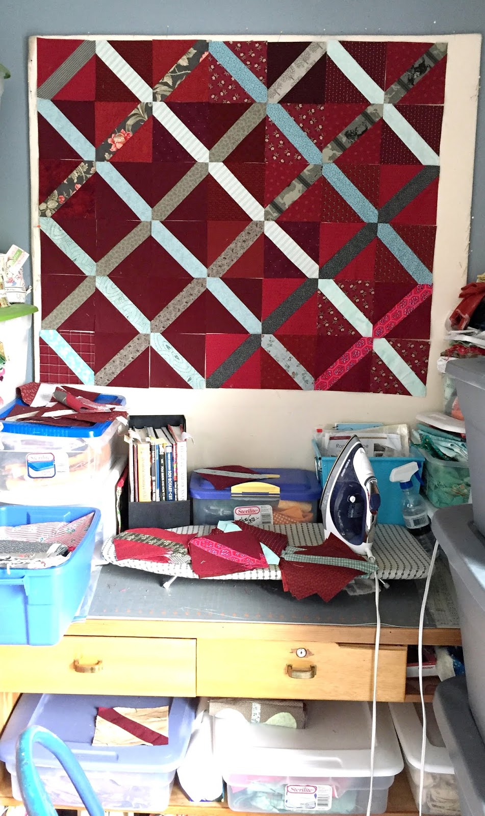
| Sewing the blocks |
There are 120 blocks in all so this is just a small sampling of what it might look like. I can say with all certainty that I am most definitely at the stage with my hands in my hair wondering
what in the world was I thinking!
 |
| The first layout audition |
LeeAnn made a version of this same U&U Lattice quilt and hers was simply stunning. So light and airy! Mine is a nightmare waiting to happen! lol Or maybe not. It's really too soon to tell. My son is leaving for the weekend and so I will be taking over his bedroom floor upstairs near the quilt room in an effort to wrestle these blocks into submission.
 |
| Gonna take some reshuffling..... |
At first glance I am despairing over my decision to use leftover bits of fatquarters and thus, severely limit the number of repeats that I have per block. On the other hand, limitation is part of what can make these quilts look so charming, right? The only thing that I'm immediately happy with is the different shading of reds in the background. And it looks even better when I stand back and take the long view. This was the part that was really stressing me out. Digging into my stash for these reds the very first time was fine. The second time a bit more difficult. The third time {when I ran out AGAIN} was a joke. Basically I just threw everything that might, possibly, sort of? work together, especially if you were riding by on a very fast horse. There will be NO going to the store and buying new fabric for this one. That would totally defy the reason we are doing UandUQAL quilts in the first place!
Okay, lots to work with here! Time to roll up my sleeves, break out a Pepsi and get to work. Linking up with
Wendy at her Peacock Party!


I love it. The different shades of red offer so much depth. The diagonal shards have high contrast (which I love). This is going to be fun.
ReplyDeleteWow!! Your Red is a Neutral concept is daring and gorgeous! I had the same problems when I tried a quilt using red for the background. It's bright and bold and when all was said and done, I loved it. I think yours is heading there too. It's a different quilt than you usually do, but it is stunning! Keep going, I think you'll love it!
ReplyDeleteThe lattice almost create a 3-D effect and the variety of red makes the background interesting and real.
ReplyDeleteIt's interesting to see where limitations -- like your using only what you have on hand, using only reds, etc. -- take us. It will be interesting to watch how this develops, Audrey. I'm sure the recipient will love it. (Who doesn't love a red quilt, right?)
ReplyDeleteI'm with the other commenters -- I love what you're doing with the reds, and it makes me want to go downstairs and start the exact same project! Which you know I couldn't even make myself do, and of course I still have a few other things to clear out before I even could! However, I have been thinking lately about using more red, so perhaps that's part of it. As to the bullseye, can't wait to see the direction it takes.
ReplyDeleteI laughed. "If you want rigid formality, you are currently visiting the wrong blog!" just cracked me up. I love your medallion. Looking forward to see this one grow. On the other hand, I don't understand the "nightmare waiting to happen" part. To me, your lattice is gorgeous! I love the different shades of reds with the grey-brown-ish lattice shining on top like the sun is hitting it from different angles (maybe through the branches of a tree). It looks so 3D. You are doing great so far. Enjoy the process. :^)
ReplyDeleteYes. Your lattice is marvelous, and definitely 3-D, and I much prefer it to the original. I know that stage of thinking wtf, it is a part of the process, but imho your work is spot on. I love the red halo on your top block, perfect finish. You are amazing. Your work is amazing. Freddy Moran was right, red is a neutral.
ReplyDeleteOh my gosh!!!! I LOVE this quilt!!!
ReplyDeleteI too love this! All the different shades of red really give depth & interest, depicting perfectly how 'red' could be a neutral. Loving your 'bullseye' centre too.
ReplyDeleteI like this too, especially the way the reds are working as a background. I'm sure that given time, thought, tweaking, you will get the lattice working in a way that pleases you more (since it seems to be pleasing the rest of us already). Maybe even just adding more blocks will help.
ReplyDeleteI love all the different reds Audrey and your lattice - carry on!!!
ReplyDeleteThe reds and pale blue simply glow. How clever of you, Audrey.
ReplyDeleteI think you are definitely on the right track with all the reds, it is looking stunning and I love it. As someone who enjoys eyeballing my applique placement I know I'm visiting the right blog :)
ReplyDeleteI love the different reds and I certainly think it is too early to call this anything but another great quilt in process. Love it so far.
ReplyDeleteI'm smiling here because you sound just like me! on so many fronts. Caving in an starting something because you couldn't stop thinking about it - that's me all over. I love the red lattice design, but understand your frustrations too. Thank you for linking up to the Peacock Party.
ReplyDeleteI had to follow the link to find out what the UANDUQAL is. I see that you are doing your own thing for it? I like the overlapping design that so many are working on. If I were doing it, I would have to do it where the overlapping rings show easily. Just my personal preference.
ReplyDeleteRed is always a good choice. So many people like reds
Don't despair over the reds in this - it is going to be gorgeous (it is already!).
ReplyDelete